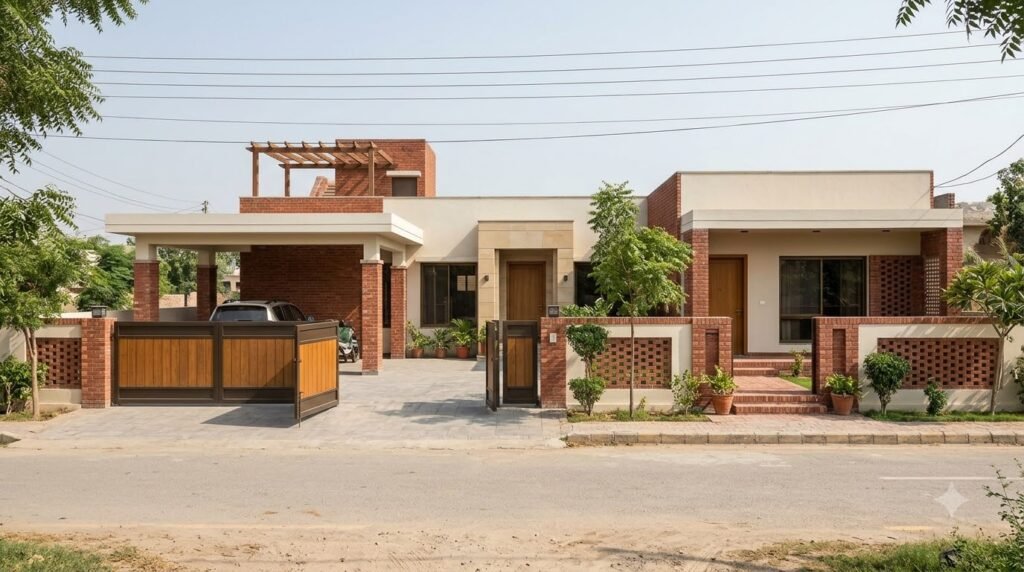
Warm brick can give a house a sense of texture and familiarity. Its colour changes with the light, and a recessed entrance can feel welcoming without elaborate decoration. The most convincing brick exteriors usually begin with a clear composition: a few materials, deliberate openings and details that belong together.
Part of the FitOnear Home Design Ideas guide, our starting point for planning a home around real family life.
Illustrative design guidance. The featured image is an AI-generated concept from FitOnear’s dream-home collection, not a photograph of a completed project or a verified construction plan.
Begin with the house, then choose the finish
Look at the position of the entrance, the main windows and the roof edge before deciding where brick belongs. Ask which part of the facade should draw the eye. It might be a sheltered doorway, a garden-facing wall or a simple vertical element beside the entrance.
If every surface competes for attention, adding another finish is unlikely to help. Sketch the elevation in plain tones first. A calm arrangement of openings should still make sense before brick texture, plants or decorative lighting are added.
Palette 1: Brick, pale plaster and warm timber
This is a gentle direction for a family home: brick provides the textured element, pale plaster gives the eye somewhere to rest, and timber or a suitable wood-look finish marks the entrance. Keep the timber tone consistent across the main door and any adjacent detail rather than introducing several unrelated browns.
Where it works visually: a brick volume beside a quieter plaster wall, with a recessed doorway connecting the two. The palette can also continue into a courtyard or entrance lobby without covering every internal wall in brick.
The trade-off: pale surfaces can make staining more visible, and exposed timber needs a maintenance strategy suited to the product and conditions. Ask how runoff is controlled above the doorway and where each material stops.
Palette 2: Brick with restrained dark frames
Dark window frames or metal details can give brick a sharper outline. Use them to reinforce the actual openings, rather than adding decorative strips with no relationship to the rooms behind them. A simple roof edge can help keep the composition coherent.
Where it works visually: a compact facade with a limited number of openings and a clear entrance. One repeated dark tone is often easier to coordinate than different black, bronze and charcoal finishes.
The trade-off: colour alone says nothing about the performance of windows or doors. Ask for the actual frame, glazing, weatherproofing and installation specification. A slim-looking frame in an image should not be mistaken for a verified product detail.
Palette 3: Brick, a shaded veranda and planting
Here the character comes from depth. A covered entrance or veranda creates a transition between outside and inside, while planting softens the edge of the wall. Furniture and the walking route need to be considered together so the sheltered space is useful, not just decorative.
Where it works visually: a house that genuinely opens onto a garden or courtyard. The veranda can become a place to pause, receive someone or sit at a quieter time of day.
The trade-off: the roof, columns and paving must fit the site and the actual movement of people. Plants need room for growth and upkeep. Keep access to windows, drains and maintenance points in the brief.
Do not confuse appearance with construction
A brick-looking exterior might use full brick, a veneer system or a different facing product. The photograph or rendering cannot establish the wall build-up. Ask your designer and supplier exactly what is proposed and how it connects to the rest of the building.
Do not assume that a red brick finish, by itself, guarantees a cool or energy-efficient house. Thermal performance depends on the whole assembly and climate. For a broader explanation of the relationship between materials, site and solar design, see the U.S. Department of Energy’s passive solar design guide. Its principles need project-specific interpretation.
Approve a sample combination, not a tiny swatch
Ask for a representative sample panel showing the proposed brick, mortar colour and joint appearance. View it beside the window-frame and plaster samples in outdoor light. A small isolated sample cannot show the rhythm of a full wall or the way the joint changes its overall colour.
Discuss corners, window returns, sill details and transitions at the roof and paving. These junctions are where the different materials must work together. Ask who is responsible for coordinating them before work begins.
- What exact product and wall system are being proposed?
- Can we see a representative panel and an appropriate completed example?
- What maintenance does the supplier specify?
- How will runoff and vulnerable junctions be detailed?
- Can matching material be obtained for repairs or later changes?
- Does the quoted scope include installation details and finishing around openings?
A simple direction to develop
Choose one dominant finish, one quieter companion and one accent. Then remove any decorative element that does not support the entrance, the windows or the outdoor space. This is a visual starting point, not a universal formula; the house should still reflect the people who live in it.
Explore our modern brick courtyard house for a coordinated visual collection. Continue with courtyard design ideas or return to the complete home-design guide to connect the exterior to your rooms and family priorities.
Get the Pinterest pin & social images
Ready-made graphics for this article: Pinterest 1000 × 1500; Facebook/X 1200 × 630. Download an image and add your own caption, or use the share buttons to open a composer.